Archives: Projects

  • Hari Warisan (Cultural Day) for Malay Heritage Foundation (MHF), (Design & Art Direction)

    Hari Warisan (Cultural Day) for Malay Heritage Foundation (MHF), (Design & Art Direction)

    Hari Warisan is a new initiative to acknowledge and appreciate our cultural practitioners and activists. As custodians to our cultural heritage, they are the lifeblood that keeps our arts and heritage alive.  MHF also hopes to facilitate knowledge transfers from one generation to another, and to encourage more young activists to step forward.  Join us in celebrating these community assets and nurturing the future role models and cultural leaders who can motivate and inspire our next generation and beyond.

    Hari Warisan 2021

    EDM Invitation for Hari Warisan (2021) – Morning Session
    EDM Invitation for Hari Warisan (2021) – Afternoon Session
    Backdrop of Hari Warisan (2021) – Morning Session
    Backdrop of Hari Warisan (2021) – Afternoon Session

    For 2021, as their Digital Designer, I was tasked with producing the design graphics, illustrations & proposing the style for the event collaterals, which was held at Kampong Gelam, Malay Heritage Centre. The overall look and feel of the inaugural event were to represent grandeur and exclusivity (as it is by invitation only) while maintaining a Malay heritage/arts design.

    Slide Deck for Hari Warisan 2021 – Includes past works and events through 2021.
    Opening speech by the President of Singapore, Madam Halimah Yacob. (Credit: MHF)
    Hadiah Warisan Recipient (2021), Mr. Idris Ali, artist/illustrator. Also my former art teacher. (Credit: MHF)
    Tunas Warisan Recipient (2021), Ms. Shaza Ishak, represented by her sister to receive the certificate award on her behalf. (Credit: MHF)
    Teman Warisan Recipients (2021), from left, Anis Qurratur’aini Azman, Liyana Nasyita Shukarman and Muhammad Hafiz Rashid. (Credit: MHF)

    The collaterals produced for the event included EDMs, backdrop, event brochure, sash, certificates, social media posts (Facebook, LinkedIn), supers (lower-thirds) and slide decks. These were done with together in collaboration with the wonderful team in MHF, volunteers and artists.

    Cultural Medallion and Young Artist Award Video (2021)
    Hari Warisan 2021 Event Video

    Hari Warisan 2022

    For 2022, with the role as Art Director, I worked with another designer to recreate the EDM with the above (2021) reference. Maintaining the same logo and refreshing the designs was the task ahead of the event. Notable new designs include profile posters of participating performers, speakers, panellists and award recipients.

    EDM Invitation for Hari Warisan (2022) – Morning Session
    EDM Invitation for Hari Warisan (2022) – Afternoon Session
    Hari Warisan 2022 Slide Deck

    Performers’ Profile

    Keynote Speaker, Moderator and Panelists’ Profile

    “The Heritage” by Shafyre

    Artist, Shafyre promotional poster for his artwork “The Heritage”, which was created live during Hari Warisan 2021.
    “The Heritage” Painting by Shafyre @ Hari Warisan 2022

    The Design Challenge

    The biggest challenge was how to top off the standard that I set myself in 2021. As I was given full autonomy in designing the works for 2021, it was easier back then to create and produce. Working with another designer has provided the opportunity for growth for the role, as soft skills such as communication came, especially communicating ideas and concepts; setting the creative direction of the event for MHF.

    Hari Warisan Segment 1 – Morning Session
    Hari Warisan Segment 2 – Afternoon Session

    Overall, to be part of the team designing these works means gave a meaningful purpose. For engaging my services for consecutive years, I hope to continue producing more and better designs for the time to come. Please support MHF wherever you can, also by this link also.

    Malay Heritage Foundation Websites and Social Media

    Website | Giving.sg

  • Syed Hussein Alatas Memorial Lecture – National University of Singapore (NUS) – (Digital Design)

    Syed Hussein Alatas Memorial Lecture – National University of Singapore (NUS) – (Digital Design)

    Named after the Department of Malay Studies’ first department head and well-respected scholar, the late Dr Syed Hussein Alatas, this lecture series aims to invite eminent scholars/leaders to deliver lectures that will contribute to deepening awareness of the Malays in the region as they confront the challenges of globalisation, change and social reconstruction. The lecture series was launched in May 2018 and is supported by MES Group.

    4th Syed Hussein Alatas Memorial Lecture (2021)

    Syed Hussein Alatas Memorial Lecture Event Banner
    Syed Hussein Alatas Memorial Lecture Event Banner
    Professor Wang Gungwu delivering his lecture (Credit: NUS)

    The process behind the artworks was to use the brand colours of NUS and incorporate it into the designs. The uneven shapes and flow art direction were used to showcase the significance of how the lecture talks are usually held where the peaks and lows of lectures of human interactions. The photo for the late Syed Hussein Alatas, was photo-edited with a black and white style, touching up the lighting to commemorate his contributions even though he has passed. For 2021, the lecture was conducted on the Zoom platform due to COVID-19. This was done in collaboration with NUS Department of Malay Studies, Faculty of Arts & Social Sciences.

    Facebook Page Registration for Lecture
    Event Photos to encourage sign-ups
    Zoom Webinar (Credit: NUS)
    Panel discussion between Professor Wang Gungwu (left) and Professor Syed Farid Alatas (right) (Credit: NUS)
    4th Syed Hussein Alatas Memorial Lecture Webinar Video

    5th Syed Hussein Alatas Memorial Lecture (2022)

    Registration poster for 5th Syed Hussein Alatas Memorial Lecture
    Lecture backdrop for 5th Syed Hussein Alatas Memorial Lecture
    Lecture and Speakers Profile poster for 5th Syed Hussein Alatas Memorial Lecture

    For this project, my role as an art director was working together with another designer for this. As this project was retained consecutively, the creative direction changed once more to a modern look to reflect the topic of the lecture. Using block-shaped graphics with shades of purple instead of NUS brand colours as the lecture could stand on its own; as it’s the fifth year of the lecture. The event was held with live audiences in 2022 after the relief measures of COVID-19 were lifted.

    From left, Dr. Pervez Amirali Hoodbhoy, Head of Malay Studies (NUS) Associate Professor Maznah Mohamad, Professor at Singapore Institute of Technology, Dr. Yaacib Ibrahim (Credit: NUS)
    The lecture was conducted in front of live audience (Credit: NUS)

    Website for Syed Hussein Alatas Memorial Lecture Link

  • Oriell Gallery (Front-End)

    Oriell Gallery (Front-End)

    Website Preview of Oriell Gallery

    Front-End Development of the concept of Oriell Gallery, a platform where artists and designers can showcase their artwork, get quotations and sell their artworks as non-fungible tokens (NFTs) online.

    Concept and ideation of Oriell Gallery full overview.

    Interface front-end design can be found via this link

  • CarryMe (Front-End)

    CarryMe (Front-End)

    CarryMe Final Look
    • Carryme is a delivery service for users and transporters to exchange goods to be delivered
    • Users are able to list and price their goods online for transporters to deliver
    • Transporters can view and accept the delivery upon registering and creating a profile on the website
    • Roles between users and transporters are interchangeable (flexible)

    User Personas

    Users

    • Not limited to any age groups
    • Targeted at individuals, small businesses to transport goods at their own price

    Transporter

    • Targeted at users with vehicles able to transport goods
    • Upon accepting the goods to be delivered both parties will accept and meet at the location to deliver the goods to the destination

    Style meets Function

    Wireframes

    Typography: Open Sans

    Shapes will be squares and rectangles to represent boxes of goods

    Easy-to-use navigation for users and transporters

    Functions

    Register

    • Registration with an Email verification link
    • Password Validation

    Login

    • Change Password
    • Change Username

    Create Profile

    • Edit profile
    • Upload Image
    • Personal Details

    List Items

    • Upload item image
    • Details of delivery item
    • View types of services (All, Fix, Flexi)
    CarryMe – Delivery at your fingertips (Website Preview)

  • PageVio (Web Design)

    PageVio (Web Design)

    An early concept, this was before the name “PageVio” came to fruition. This had a tech theme to it.
    This one features a vibrant, youthful and energetic feel with the targeted audience at young adults following the key visuals that are present.
    This has a neutral theme with the illustrations. The art direction was to be open, welcoming and participative.
    This was the selected web page for the web application’s landing page. This was directed more towards B2B audiences.

    Please note: PageVio’s web application features are similar to the mobile application.

    The major difference is the web application has a Create function that mirrors WordPress’s blogging features. The mobile application would also have the same feature down the line in later versions after the soft-launch.

  • PageVio (UI/UX)

    PageVio (UI/UX)

    A fresh role in web and mobile app development
    Based on Wattpad and Medium apps.
    An e-book, e-publication web & mobile app for reading and creating.
    For creators by creators. For businesses to publishers too.

    The idea was to create something that allows others to participate and be creative together

    Full Interface Workflow Link

    Early Ideation & Processes

    Ideation process
    Sketches of wireframes

    My role & responsibility in this project was as the design consultant. The responsibilities are to oversee the project requirements, liaise with the development team, coach interns, create a marketing strategy for the app, designing and testing of the UI/UX.

    Wireframes (Mock-up)

    Low-Fidelity Wireframes
    Mid-Fidelity Wireframes – With some branding guidelines

    Workflow

    1 . Style Guide – Light and Night Modes
    2. Overall User Workflow – Adobe XD before August 2020 update where multiple flows can be present in a single file. Previously we had to dissect the main workflow to singular features before sending to development team.

    This is the beta-prototype user workflow. The ones in green boxes above the artboards are fleshed out, good to go. The ones in yellow require some attention and fine tuning. There are none in red (previously there was for some features), as most of the features are thought out, discussed and visualised.

    Style Guides

    Default Light Theme Style Guide
    Dark “Night Mode” Theme Style Guide

    A style guide was established to ensure brand consistency throughout the app. We tried to minimise the use of multiple colours going for a neutral feel and look with whites, greys and blacks.

    The primary colour was used as a highlight/key colour when the user interacts with the app. A mono-gradient was also part of this colour system as it is the focus on a single featured button.

    Buttons and drop downs are designed with a drop shadow to create emphasis to user interaction within the app.

    Alpha Version

    High-Fidelity Mockup sent for development

    The development team sent me the first version of the mobile app just before the lockdown. Most of the design features sent were present in the developed application. The app was coded using React Native as it was a hybrid design that could work on both iOS and Android mobile.

    The rest of the features in the app are either replicable social features present in various mobile apps or work-in-progress.

  • Marsiling Primary School

    Marsiling Primary School

    For Marsiling Primary School’s Diamond Jubilee (60th Anniversary) celebration, the project involved internal and external stakeholders that would be involved in the celebration.

    The client wanted the celebrations to include students, staff and guests. The overall art direction was to promote a “still going strong” and to highlight their landmark 60th Anniversary.

    These artworks are done collaboratively in a team, with each member rotating roles and responsibilities in ensuring that the artworks are met to client’s satisfaction.

  • Junior Art Lab

    Junior Art Lab

    Redesign and creating a brand guide for Junior Art Lab, an Ed-Tech social enterprise start-up, specialising in nurturing young kids from 4-12 years old in making art using software. The colours, shape and typography was to reflect the welcoming, vibrant and positive values of the start-up that would be reflected on their collaterals.

    Facebook

  • Help with a Heart

    Help with a Heart

    Help with a Heart 0416 FA-1.png

    Year
    2018

    Client
    Legal Aid Bureau

    Agency
    Orgnix Creatives

    Synopsis
    Help with a Heart features the everyday heroes of Legal Aid Bureau under the Ministry of Law. This e-publication shares their stories and experiences of their career and professional life helping and empathising people who require Legal Aid to get through the challenges that they face in their life.

    View the publication

  • Muse SG: Bicentennial Edition – National Heritage Board (NHB)

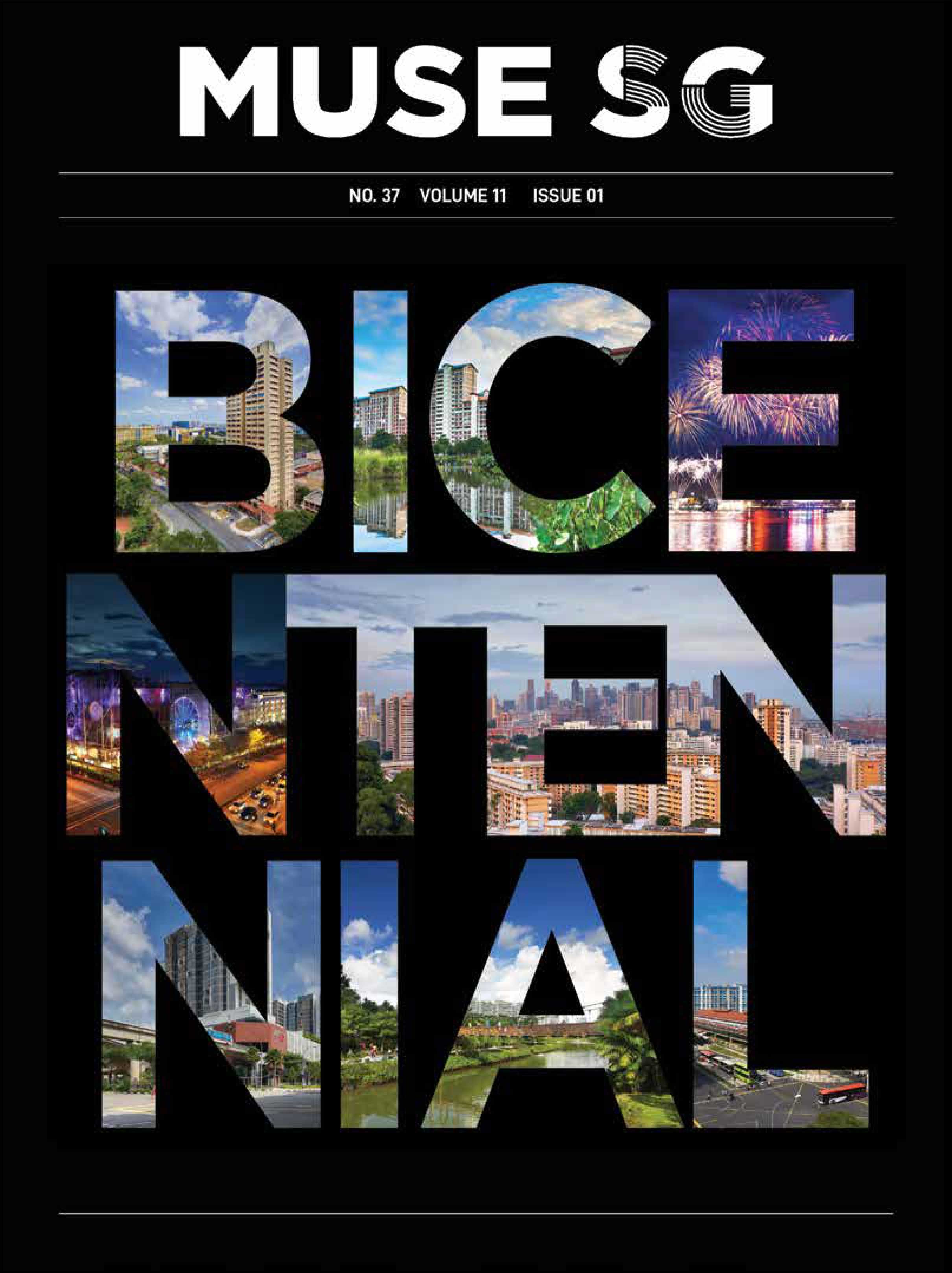
    Muse SG: Bicentennial Edition – National Heritage Board (NHB)

    MUSE-SG-0628-(FA-low-res)-1

    Year
    2018

    Client
    National Heritage Board

    Agency
    Orgnix Creatives

    Synopsis

    MUSE SG was a collaborative project with National Heritage Board. This issue, it was to celebrate Singapore’s Bicentennial History. The inserts feature stories and experiences of communities in Singapore. From the first satellite town of Toa Payoh to Bukit Panjang’s remote town more than just a byway, these are some of the stories shared in this four-part issue; with this being the first. This was done with the client and freelancer making it one of the more successful collaborations.

    A publication distributed at National Heritage Board (NHB) locations in Singapore.

  • My Information is not for Your Dissemination

    My Information is not for Your Dissemination

    my information poster 1.jpg

    This project is about building awareness to users on posting private information online. The poster emulates a dot-matrix computer paper form  and glitch effect as the style. It is made up of sensitive information as seen in the video below as well.

  • The Rave

    The Rave

    Main Poster – Created using watercolour

    The Rave is a collective illustration for XL Recording’s artist The Prodigy. A 2014 D&AD entry, this is an illustration to showcase the crowd at The Prodigy concert.

    Flipbook of “The Rave”

    For Behance, Music Video Link

  • Singapore South East Asian Youth Program (SSEAYP) – Nippon Maru – Friendship over the Years

    Singapore South East Asian Youth Program (SSEAYP) – Nippon Maru – Friendship over the Years

    T-Shirt designs for Singapore South East Asian Youth Program (SSEAYP) in 2016 and 2018 respectively (left to right).

    On left, the design was to create a dynamic youthful design as to reflected with the dolphin graphics and the shape of the number “30” to be reflected as such.

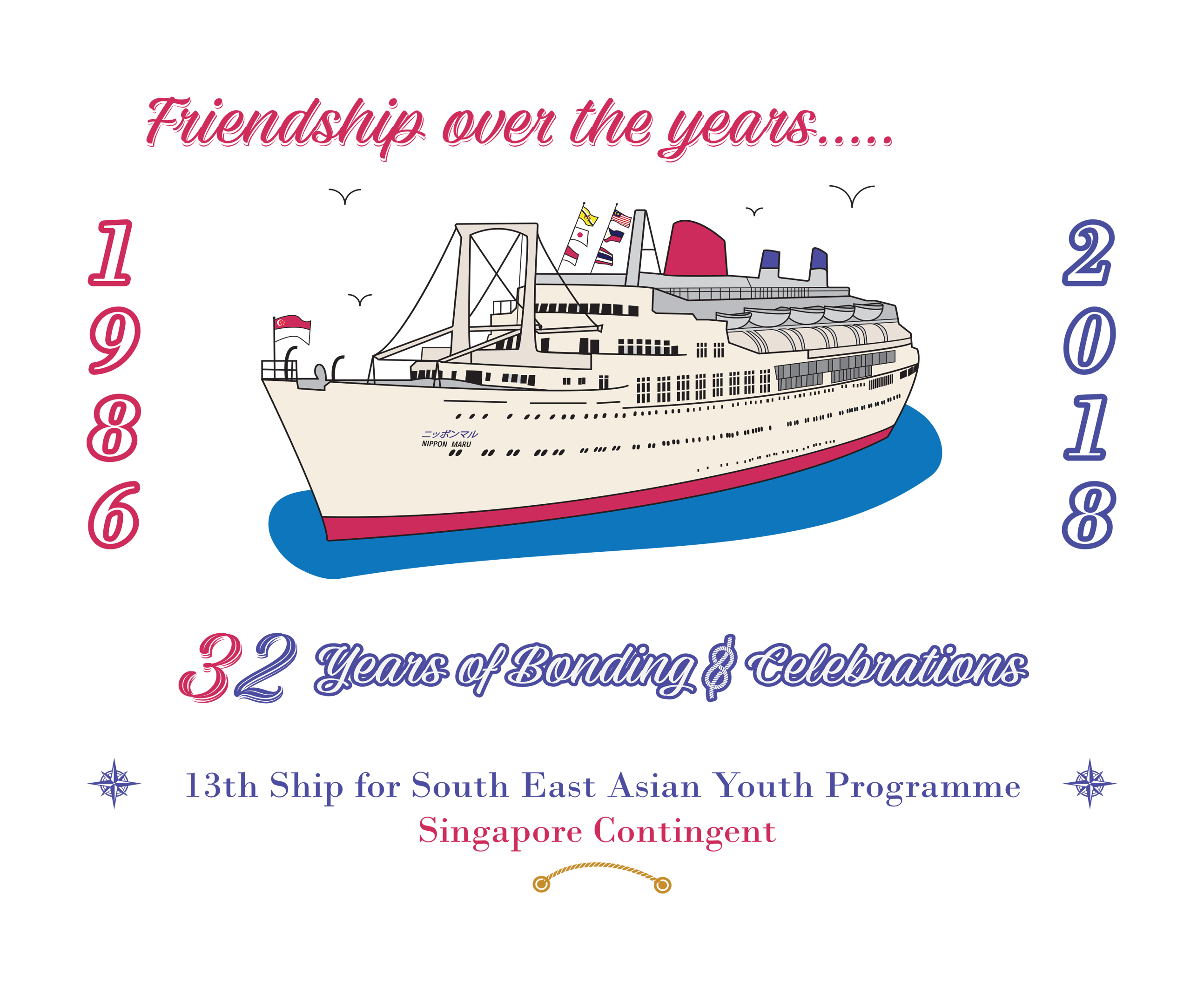
    On right, it was requested that an illustration of the ship in which the group sailed was visualised and text in the design were to look like a frame.

  • Block 427

    Block 427

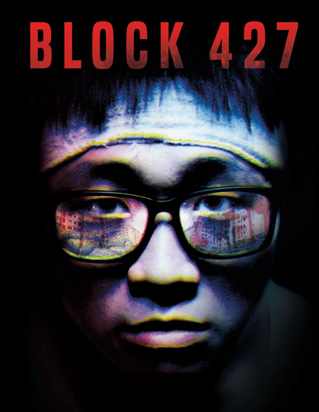
    Block 427 is a Film by Puttnam School of Film. The project is to create a press release kit, a DVD cover and a poster to promote the film. Debut at the Avant Premiere 2016.

  • o7: A New Level of Surveillance

    o7: A New Level of Surveillance

    Human senses. They create experiences for us everyday in our lives. This compendium and creative journal discusses the journey of our lives under surveillance. With references from George Orwell’s “1984” and Aldous Huxley’s “Brave New World”, this compilation discusses the darker side of surveillance. Conceptualisation is inspired towards 1984’s Big Brother’s thought police. It discusses the cause and effect of surveillance in modern societies from individual, group and corporate standpoint.

  • The Spaces In Between

    The Spaces In Between

    IRBE7455IMG_4984IMG_4987

    This project is about living environments through a bird’s eye perspective.

    A photography series using a 360 camera.

  • Super Bass

    Super Bass

    nicki minaj 2superbass

    Music is the flavour to our soul and in average, it lasts 4 minutes. A song can change a person’s mood, influence and experience in the moment. Breaking down the technical aspects of what goes in the song is the agenda of this infographic.

  • Swag Jack

    Swag Jack

    swag-jack-lino-print-2013.jpg

    Lino Printing 2013. Meme Branding.

  • Blooms Remastered

    Blooms Remastered

    IMG_5039Flower 2016

    Remastered 1st Artwork in 1994. Done in 2016 by paper craft. Held together by the frame with no glue. Believe.

  • Reader’s Kit

    Reader’s Kit

    Reader’s Kit is a direct mailer mock-up for The Book Cafe. The idea is to conceptualise a packaged product consisting of a bookmark, a tea bag sample and a box packaged with a fortune cookie insert where each is unique on its own.

  • Owner of a Lonely Heart No More

    Owner of a Lonely Heart No More

    Random Unorthodox Photography XD

  • Land Transport Authority (LTA)

    Land Transport Authority (LTA)

    Promotion collaterals for Senior Citizen EZ Link and Passion Card holders for the new Auto-Top up service.

    The requested design was for a tri-fold brochure, an A4 & A5 poster and a pull-up banner. This was done collectively as a team.

  • National Environment Agency (NEA)

    National Environment Agency (NEA)

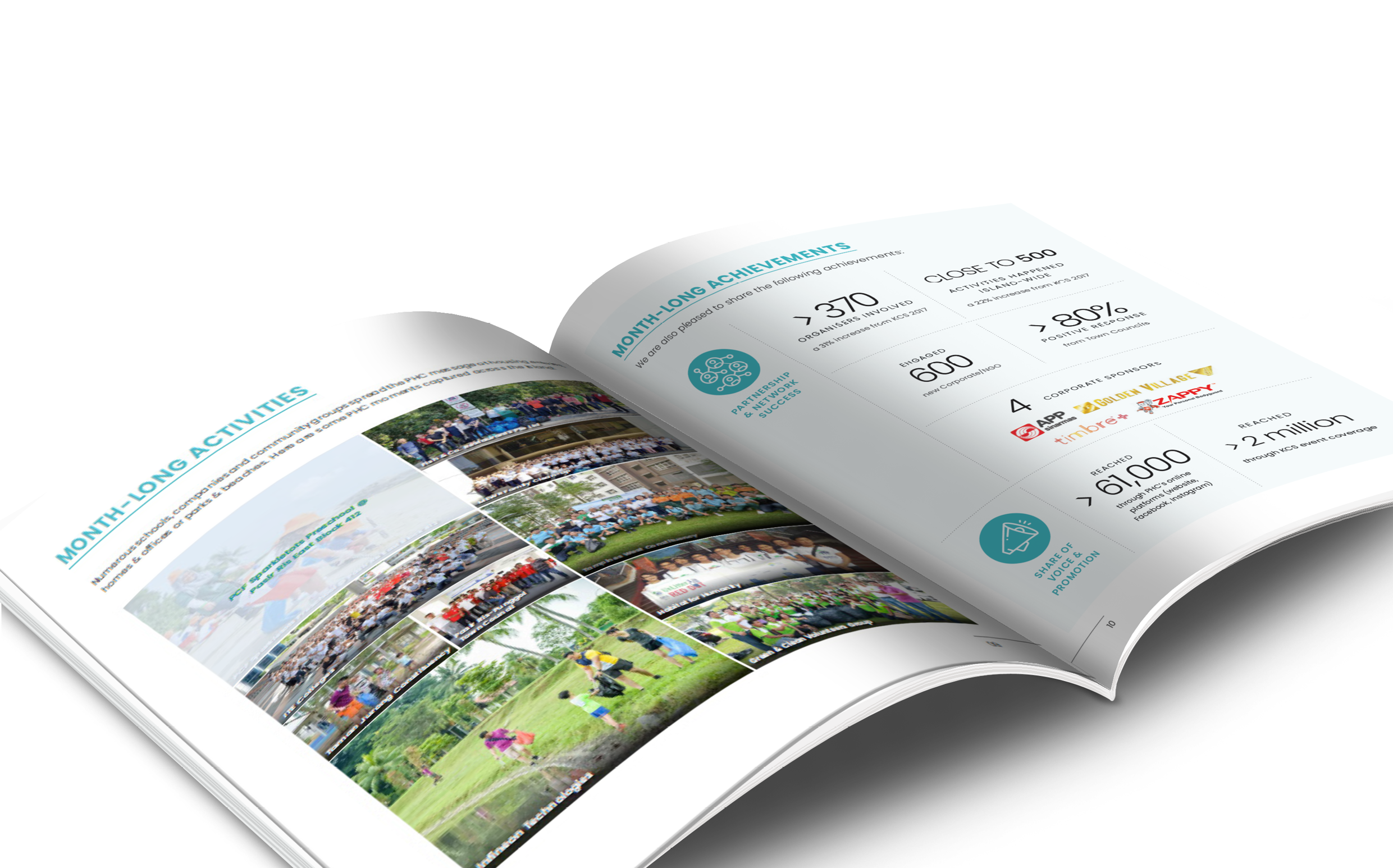
    Event report for a month-long event “Keep Clean, Singapore” with info-graphics and photo editing.

    The design, photo-editing and compilation were done with a freelancer as a collaboration. The challenge of this publication was that it had a fixed number of pages, and there were many images, text and graphics.

    Together, we overcame these shortcomings by re-evaluating the design and also including info-graphics and gallery media in the publication.

  • Public Utilities Board (PUB)

    In collaboration with Public Utilities Board, the Engineering Competency Framework are a set of training books for future engineers. This was a technical book with many terminologies and data entry that took some time to understand while working with a freelancer.

    Eventually, after clarification with client and also researching how these books are formulated, the books were printed and distributed.

  • SG:D Spark

    SG:D Spark

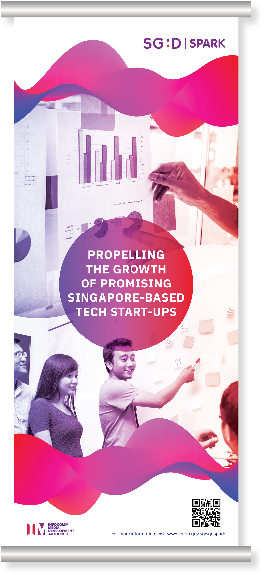
    SG:D Spark event pull-up banner and flyer to promote promising tech start-ups through grants and industry support.

  • What is Privacy?

    What is Privacy?

    Short video for a project on privacy and surveillance. It is made to represent the ongoing purpose of surveillance in societies. And yes, the cover image are InDesign Grids for graphic purposes =)